In today’s digital age a company’s website serves a key element in its sales and marketing effort. Even if your business doesn’t sell online or even collect leads, it is usually the first impression any potential client will get when looking up your brand.
We can all agree that it needs to be updated regularly. More over, every so often it must be replaced by a new site with a modern design and technology.
In the process of planning your site many decisions need to be made. Sometimes these tactical decisions like prioritizing one feature over another. Other times its strategic ones such as focusing on specific industry verticals.
In this post I will offer some easy to produce reports and the key takeaways you can draw from them. This is in no way a closed list. I believe that the general approach should be that making these decisions has to be based on data.

Mobile conversions
Your site is going to be mobile-friendly. That’s a no brainer. Preferably even using a responsive design.
But Mobile users still differ from Desktop ones, so resizing the same content to fit a small screen just won’t do.
Mobile users are usually in a different marketing stage. Conversion rates will in most cases be lower. Moreover, you can expect them to lean in favor of different Calls to Action (CTA) from the Desktop users.
A classic example are companies with SaaS product. Driving your visitors to create a free account that they will only be able access on Desktop is futile.
What to look for
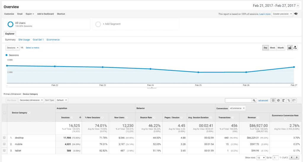
Go to Mobile Overview report. See what is the distribution of sessions by device category (Desktop, Mobile and Tablet). Compare their conversion rates by the different goals on your site to learn what they react to.
Then segment your reports to include only Mobile users. Go to the Pages report and see where they visit most (not as landing page).
Combine these two to understand what interests them and make it easily accessible on your new layout.

Language preferences
If you’re reading this then I can make an educated guess that your site is in English. At least one of its versions.
But your visitors can come from different geos and speak different languages. And even if they do convert to some extent, there’s a good chance you are underperforming.
Similarly, the same a strategic decision to expand to a new language can be rejected if conversion rates are equal across languages. In any case, this is a costly move that should rely on data rather than gut feeling.
What to look for
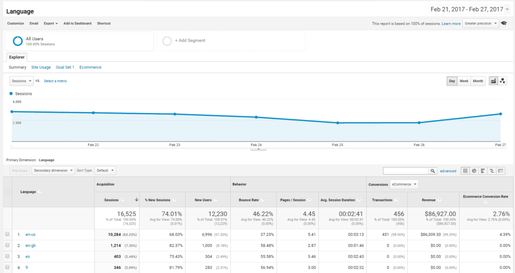
Go to the “Languages” report and identify the top languages your users speak. Look at their overall conversion rates to see how they perform. Then run a segment and look at their Exit pages to identify where they drop off.
Pro tip:
Cross reference languages with countries (as a secondary dimension) as often times languages (especially English) can be associated with multiple countries

Browser support
This one is a tricky bastard. When planning a new site you will most probably want to use current, if not cutting edge, technologies. Certainly not the same ones that were around when you built your last version.
But what about users that still use legacy browsers? Should your site support Internet Explorer 7 or maybe stop at 8? What about legacy iPhones with outdated iOS?
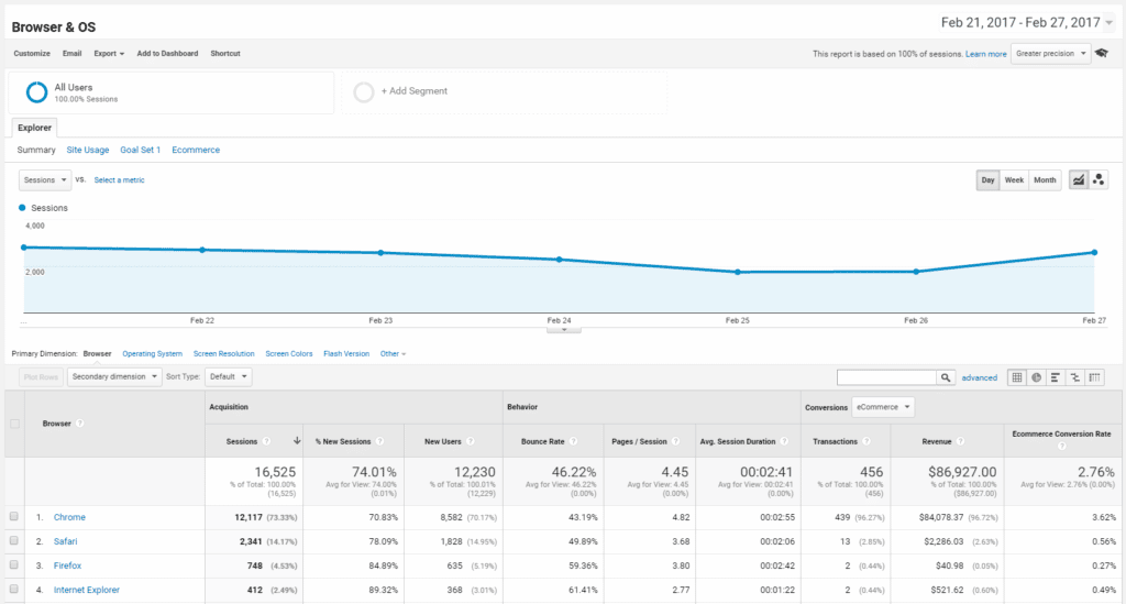
The answer depends on how many of these make your user base. Try to get a grip on how your users distribute across the main browsers and try to identify key trends (decline or increase in adoption of certain browsers).
Supporting legacy platforms is costly to build and difficult to maintain. So ruling out as many of these will your make life a whole lot easier.
Another decision that can be made based on this is report is how whether or not to invest in a Retina compatible design for iOS users. A far less complex issue but one that you should be aware of.
What to look for
Go to the “Browser and OS” report to identify leading browsers. Take a 90 day period and compare it to the previous period (or even past year) to identify trends.
Drill down into specific browsers (hint: Internet Explorer) to see a breakdown of versions you should consider supporting. Internet Explorer is more widely adopted than you would expect since many IT departments ban Chrome due to its security and memory usage issues.

Screen resolution
When planning a responsive design there are several decided breakpoints on which then design shifts to fit the new resolution better.
As on the browsers report, this too is costly to build and maintain, so should be thought through before making a decision.
The rule of thumb is to start small with a few must-have resolutions. Creating a report of screen resolution can help identify key resolutions that might affect your users experience.
One example is a large number of them on either end of the scale, very small or ridiculously large screens. Large screens can be very common if your audience is made of developers and designers. Addressing these in the planning stage will help ensure they get a superior experience.
What to look for
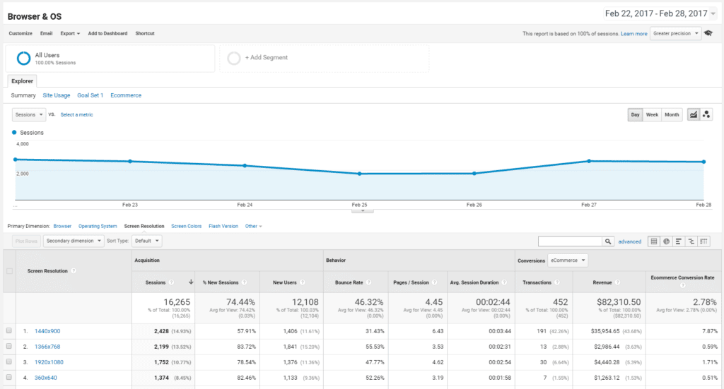
Go to the “Browser and OS” report and switch the primary dimension to Screen Resolution.

Note that some resolutions can appear twice, for both portrait and landscape orientation of the screen. Check what your Pareto is and if needed export the data out to excel for easier processing.
Look at the main resolutions. The width can assist in deciding on the breakpoints as discussed above. The screen height is important for understanding what your average fold looks like, and where should you place your CTA’s.
Final thoughts
This post tries to open your mind to several reports that can save you both time and money on design and development, as well as future optimization processes.
What it doesn’t cover, and I hope is clear to anyone in their right mind, is what users actually want from your site. What content do they engage with? What CTA’s do they respond to?
That my friends is a far more important question, certainly not one that can go unanswered.
So bear in mind that all the above applies only once you have answered that question and applied it to your planning. The rest is just cool tweaks.