In a previous post, I explained how I create a heatmap using Excel from Google Analytics 4 (GA4) data for Hour/Day breakdown. This has been by far my most popular post on the blog., driving quite a lot of Organic traffic.
In this post, I’d like to suggest a simpler alternative to this approach that uses Google Data Studio. This alternative not only is quicker and simpler to implement but also keeps your data fresh, so running a new analysis doesn’t require going through the same hassle.
Creating the report
Pivot, pivot!
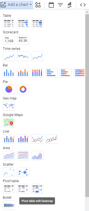
To create this report, you’ll first need to create a new Pivot Table in Data Studio (DS). To make things even quicker, select ‘Pivot table with heatmap’ (you can also do this later).
Select Metrics & Dimensions
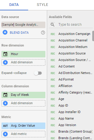
With the chart added, select your data source. In this example I’ve selected the default ‘[Sample] Google Analytics Data’, so make sure you connect your own data source.
Next, add the following dimensions and metrics:
- Row dimension – ‘Hour’
- Column dimension – ‘Day of Week’
- Metric – ‘Sessions’
Pro tip:
You can any metric you like here. I personally like to examine Sessions, Conversion Rate and Avg. Order Value.
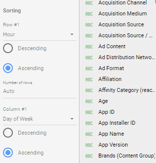
Sort
For the table to be readable, you must sort it by the right dimensions.
Sort Row #1 by ‘Hour’ (Ascending). Sort Column #1 by ‘Day of Week’ (Ascending).
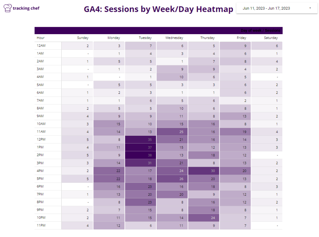
Pivot table heatmap
If you selected a standard Pivot Table during the creation, or just want to convert an existing Pivot Table to a heatmap, fear not, as it’s easy to make the switch.
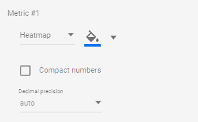
Simply hop to the ‘Style’ tab of the Pivot Table and change Metric #1 from ‘Number’ to ‘Heatmap’. Here you can also control the color coding of the heatmap.
Voilà
That’s it. Just make you expand your table so that it displays the full amount of rows and columns. I also recommend adding a ‘Date Range’ control to the report.
You can check out the report I’ve created in Data Studio below.