One of the more interesting exports I use with clients is a breakdown of metrics by Day of the week (Sun-Sat) and Hour of the day (0–23). This gives a clear visual representation of peak hours on their web properties.
While many metrics can be used, I usually find these to be the more interesting ones: Sessions, Conversions, Conversion rate.
In this guide, I’ll walk you through building the above three, and how to extract valuable insights from them.
The data shown in the guide is extracted from Google’s demo account.
UPDATE: I’ve added a new post on how to extract this report in Google Data Studio (simpler, faster, always updated!).
Step 1 — Extracting the data
In order for us to get this detailed breakdown we need to create a Custom Report in GA.
Start by clicking Customization in top navigation bar and select “New Custom Report”.
The report type I like to work with is “Flat table”, which can accommodate up to three dimensions.
In the dimension section, add “Day of week” and “Hour”(Note that there are several variations, these are the easiest to work with).
In the metrics section, for this example add “Sessions”and “Goal completions”.

Save the report and set the time frame for the data.
I like to take data from a wide time range to get a better sample. Usually 3 month of data is good enough. If your site is heavy on traffic make sure you don’t run into sampling issues as this might skew your report.
In this example I’ve extracted data for the months of September-November 2016.
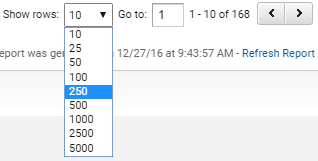
Be sure to extract all rows (should add up to 168) by adding rows to the report view.
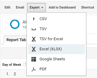
Now you can extract it to Excel (xlsx format).
You can grab my ready made report here and insert it to you Analytics account.
Step 2 — Manipulating the data
In the Excel workbook we will only use the second sheet, “Dataset 1”.
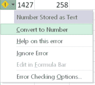
First, if the numbers in the Day and hour columns aren’t identified by Excel as numbers, select the two columns. Open the small drop-down and select “Convert to Number”.
Now, select the entire table and one the “Insert” tab on the menu click “Add Pivot table”.

In the popup window click OK. This will open the Pivot table in a new sheet.
Now you will see the new sheet with an empty Pivot table. Drag the “Day of the week” item to the columns section and “Hour of the day” to the rows section.
Finally, drag the “Sessions” item to the value section.
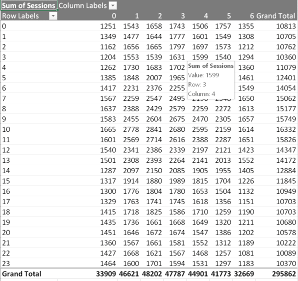
Voilà. You have a detailed table depicting the traffic to your site by days and hours.
Step 3 — Presenting the data
To make this table easier to read, we will now add a heatmap to bring out the high/low areas.
I recommend copying the table to a new sheet for this.
Select only the table’s values (without Day/Hour) and select Conditional Formatting. I like to use a color scale of red/green. You can play with colors however makes sense to you.
Note that “0” on the Days axis is Sunday and so on.
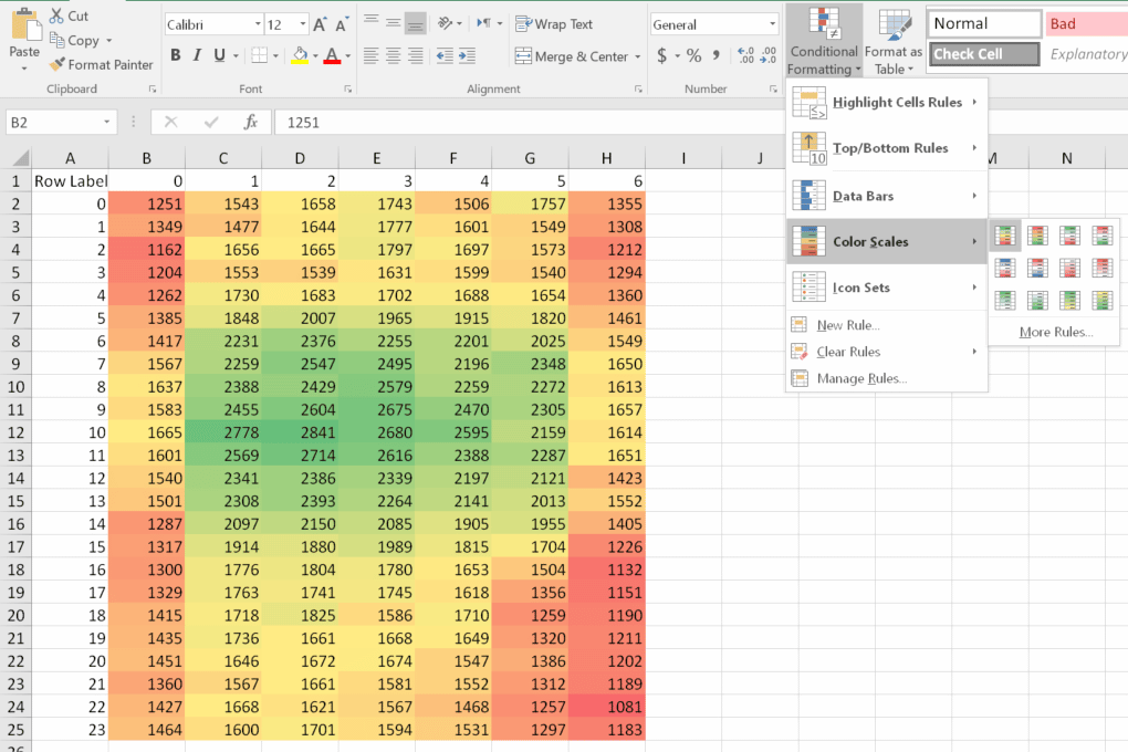
Now that the data is on a new sheet we can replace the “Sessions” in the Pivot table with “Goal Completions” and get the same report for this metric.
You can grab my xlsx file to compare.
Optional Step #1:
You can also add the total row and column and apply a color scale specifically for each (e.g. selecting only the total row). This will give you insight to comparing entire week days (Which days sells best in total? Which hour is best for daily newsletter?).
Optional Step #2:
Create a third table that takes calculates the conversion rate for Goal Completions. You can either extract the number as an additional metric when creating the report, or calculate it combining the two tables you created.
Step 4 — Analyzing the data
Analyzing the data at this level should take into account if your site works across multiple timezones. Behavior can also differ based on traffic sources, for example a weekly newsletter sent every Thursday morning will effect that day’s traffic significantly.
Looking at the two reports we produced we can see several key behaviors:
- Morning hours are of the highest traffic, peaking at 10am.
- Early morning visitors, 6–8am, have a lower conversion rate than later morning traffic.
- Goal conversion rates are highest at 1–3pm.
- Monday through Wednesday are the busiest days, peaking on Tuesday.
- Similarly, and quite unsurprisingly, Sunday and Saturday are slow days, with Saturday afternoon/evening being lowest.
- Friday has a surprisingly high conversion rate at 10am-3pm.
This of course isn’t a closed list and there plenty of other insights that can be drawn from these reports.
Actionable takeaways from the data
- Test “Early Bird” campaigns on site to encourage the 6–8am visitors to convert.
- Similarly, test driving traffic by email campaigns on Friday morning/noon.
- Routine Email marketing campaigns should be set to send at 10am-2pm.
Final thoughts
This is a rather simple exercise that can generate some quick insights to user behavior. That being said, like all analysis it should be taken with a grain or two of salt.
Traffic coming from different sources will behave differently. Traffic to your blog will differ from your product pages.
Any insight drawn from these reports should be double checked against typical behaviors that you’ve identified in key segments.
And of course, test any change you apply based on your analysis. It just might be that current behavior is working fine and your tweaks will change it for the worse. Set a clear goal you want to improve and only then examine how your changes affect the users.
Happy analyzing! 🙂
Originally published on my blog on Medium.