I love working with Google’s Data Studio (DS) for displaying Google Analytics (GA) data. There’s no doubt that this native Google-to-Google integration makes life a whole lot easier when I want to create a traffic dashboard. But the reporting needs of a large organization can be overwhelming and the demand is high. So how do I keep track of it all and how can you level up your DS game? With these 4 easy to follow tricks.
Trick #1: Create a Design Template
Designers use a “design book” when working on large projects/sites. It’s their source of truth and reference for all the different design elements they use. This is especially useful for re-usable elements – for example graphs, tables and KPI in DS. When I first came across this it made perfect sense to me, so I immediately adopted it.
Aside from saving me loads of time, it also ensures my projects are always on brand.
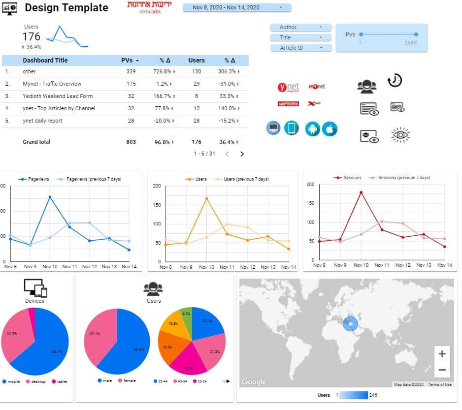
In practice, what I’ve done is created a template dashboard filled with all the different elements I’m using in my dashboards. This spans anything from title to graph, icons to logos, and even filters, table colors and fonts. I’m constantly adding design elements and this dashboard, which further extends this template.
Trick #2: Create a Dashboard of Dashboards
I always wonder, do people use my dahboards? Is all the hard work invested worth it, or am I wasting my time?
Sure, I can start asking my users if they like my dashboards, are they using it and how often. But why go to all that trouble and possible white lies when we can harness the power of data?
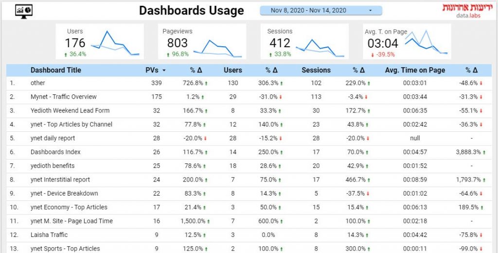
You can see I’ve created a “dashboard of dashboards” i.e. a dashboard that shows the usage of all other dashboards. If you want to make one of your own it’s pretty simple, all you have to do is connect all your dashboards to analytics.
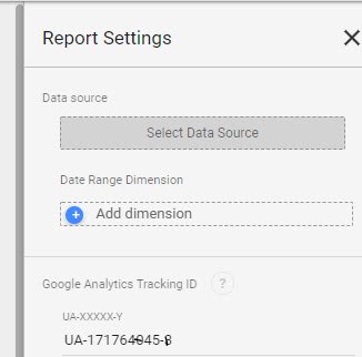
Simply create a new Google Analytics web property designated for this purpose, and copy it’s UA number. Back in DS, click on “File” -> “Report Settings” and paste the UA number in the appropriate place on the left side panel.
Repeat this on all your dashboards and make sure to give them unique and meaningful titles, as these titles will later show up in your dashboard of dashboards.
Trick #3: Create A Dashboard Index
Creating dashboards is fun, but often I find myself searching needlessly for that one dashboard I need, in DS’s homepage, among my zillion dashboards. It shouldn’t be this way, there must be an easier way to organize all of my dashboards!
Sure there is – by creating a dashboard index.
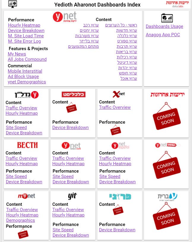
The gist is simple – one dashboard that links to all the different dashboards you’re managing.
You can play with the design any way you want. I personally try to keep it simple yet fun with a dedicated “tile” for each one of the properties I manage. The best part? By working this way I’ve basically created a map of active and future dashboards.
I know this takes us back to the early days of the web, with index sites such as AltaVista and alike, but since Google has failed to come up with a better solution, I’ll keep indexing away.
Trick #4: Add Icons to Field Names
File this one other “nice to have”, or “cool trick and nothing more” – you can add emojis to metric or dimension names to spice things up.
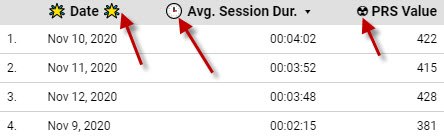
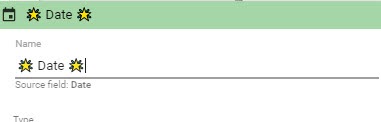
For this trick I’m using keyboard symbols AKA ALT symbols. All you need to do is pick a symbol you want to add to a field name or metric (use this site or this one, or just google it). Copy the symbol, and back in DS go to edit field name (that little pencil on the left of the field name) and paste the symbol copied as part of the field’s new name. There you have it.
Final Thoughts
Data Studio is great for traffic dashboards and other Google Analytics related data visualization, but it can be messy to work with over time and in large scale. I hope that the tricks and tips here will help you bring some order, if not to the force, then at least to Data Studio.